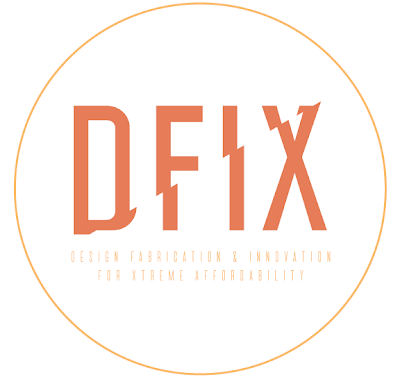
So my concept behind this logo is to show an emphasis on upward mobility (with the ascending break in the logo). It serves the double purpose of showing something that indeed needs to be fixd. I got the idea from a movie poster called Brothers, here is a link http://www.reviewstl.com/brothers-movie-review-tobey-maguire-1204/ )

I really like this, both visually and conceptually. It would be kind of interesting if our show was just called FIX. It might be too similar to EDIT though. Did we ever even get to discuss names?
ReplyDeleteWe did not get to decide on names as far as I know. I believe it is pretty set in stone.
ReplyDeleteSeems to be the common theme for our show.
ReplyDeleteI like the font below but maybe we could beef it up a bit so it holds up at a smaller size for the web
ReplyDeleteyeah I agree with Sollie, it's just kind of hard to read right now without squinting
ReplyDelete